Statistic al Learning as a Regr ession Problem
Problem Solutions
Problem 1 ( the airquality dataset)
See the R script chap
1 prob 1.R.
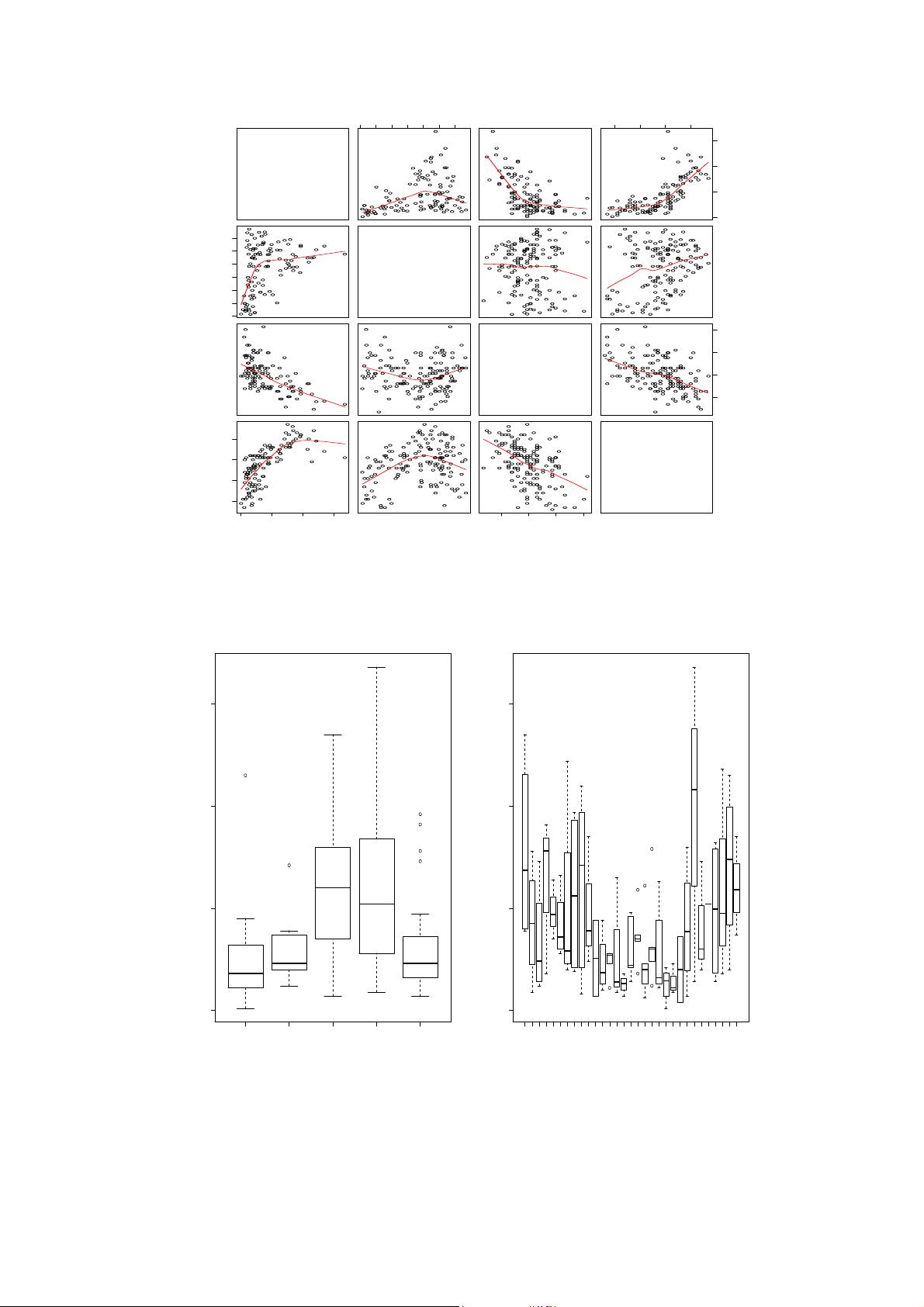
Part (1): When we use the pairs command we get the plot shown in Figure 1. In reading
a plot like this it is helpful to note that the y axis scale in each plot is determined by the
variable denoted in the same horizontal row. The x axis variable is the variable in the same
vertical row. Thus the scatter plot present ed in the (1, 2) location of the grid is a plot of
Ozone considered as a function of Solar.R. The scatter plot presented in the (3, 4) location
is a plot of Wind as a f unction of Temp. Thus plots like this enable one to quickly view
how two variable change in relat ionship to each other. The red curve is a non-parametric
“smoothing” of the data that can given a quick understanding of how the two variables
depend on each other. For example from the output of the pairs function we can see that
from the (1, 3) plot that Ozone decreases as Wind increases. From the (1, 4) plot we see that
Ozone increases a s Temp increases. Comparing the “transpose” plots i.e. (1, 3) and (3, 1) can
give an argument as to which variable should be the response and which variable should be
the explanatory variable. For example in the (3, 1) plot it looks like Wind is almost a linear
function of Ozone while from (1, 3) it does not look like Ozone is a linear function of Wind.
Part (3): Using boxplot to plot Ozone as a function of the categorical variable Month we
get the plot show in Figure 2 (left). Plotting Ozone as a function of Day we get the plot
show in Figure 2 (right). There is a clear pattern in that Ozone concentration seems to peak
during the mont hs of July and August. There is also a much larger range of possible values
during these two months. There does not seem to be much of a pattern in the behaviour of
Ozone as a function of Day. To use these variables in the scatterplots from Part ( 1) earlier
we would have to specify t he set of months or days to study in the scatterplots.
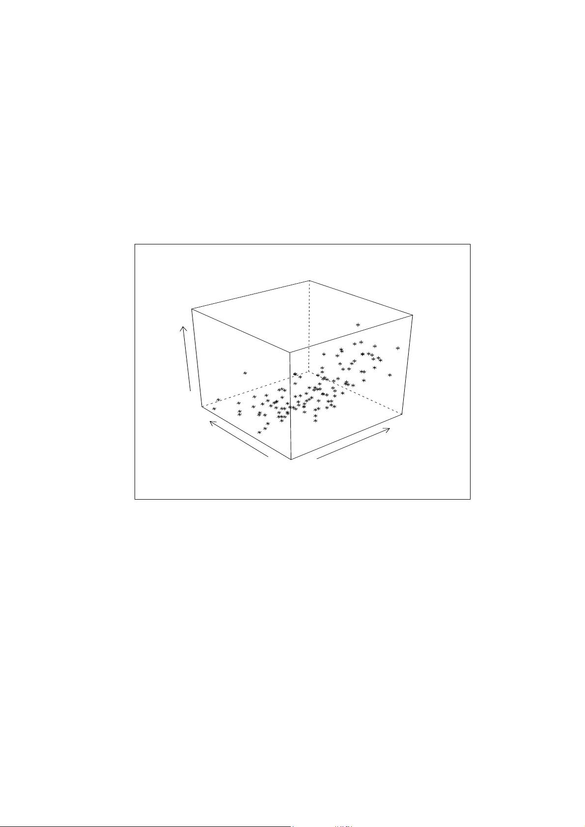
Part (5): When we use the cloud command we get the plot shown in Figure 3. We can see
that Ozone increases as Temp increases and Wind decreases.
Part (6): When we use the coplot command we g et the plot shown in Figure 4 . In that
plot it looks like the way that Wind is kept constant is to break it up into ordered bins and
consider the samples that fall in each bin. From the given plot it looks like that when Wind
is held constant the general trend is for Ozone to be an increasing as Temp.
Problem 2 ( complexity of the fitting function)
See the R script chap
1 prob 2.R. When that script is run we get the result show in Figure 5.
2


