
# Bootstrap Tree View
---

[](https://www.npmjs.com/package/bootstrap-treeview)
[](https://travis-ci.org/jonmiles/bootstrap-treeview)
A simple and elegant solution to displaying hierarchical tree structures (i.e. a Tree View) while leveraging the best that Twitter Bootstrap has to offer.
## Dependencies
Where provided these are the actual versions bootstrap-treeview has been tested against.
- [Bootstrap v3.3.4 (>= 3.0.0)](http://getbootstrap.com/)
- [jQuery v2.1.3 (>= 1.9.0)](http://jquery.com/)
## Getting Started
### Install
You can install using bower (recommended):
```javascript
$ bower install bootstrap-treeview
```
or using npm:
```javascript
$ npm install bootstrap-treeview
```
or [download](https://github.com/jonmiles/bootstrap-treeview/releases/tag/v1.2.0) manually.
### Usage
Add the following resources for the bootstrap-treeview to function correctly.
```html
<!-- Required Stylesheets -->
<link href="bootstrap.css" rel="stylesheet">
<!-- Required Javascript -->
<script src="jquery.js"></script>
<script src="bootstrap-treeview.js"></script>
```
The component will bind to any existing DOM element.
```html
<div id="tree"></div>
```
Basic usage may look something like this.
```javascript
function getTree() {
// Some logic to retrieve, or generate tree structure
return data;
}
$('#tree').treeview({data: getTree()});
```
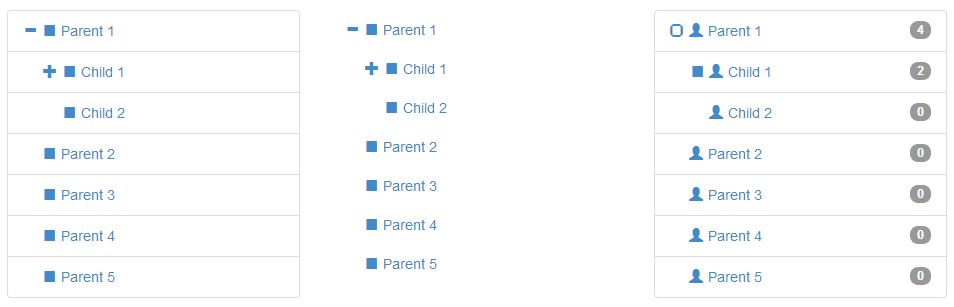
## Data Structure
In order to define the hierarchical structure needed for the tree it's necessary to provide a nested array of JavaScript objects.
Example
```javascript
var tree = [
{
text: "Parent 1",
nodes: [
{
text: "Child 1",
nodes: [
{
text: "Grandchild 1"
},
{
text: "Grandchild 2"
}
]
},
{
text: "Child 2"
}
]
},
{
text: "Parent 2"
},
{
text: "Parent 3"
},
{
text: "Parent 4"
},
{
text: "Parent 5"
}
];
```
At the lowest level a tree node is a represented as a simple JavaScript object. This one required property `text` will build you a tree.
```javascript
{
text: "Node 1"
}
```
If you want to do more, here's the full node specification
```javascript
{
text: "Node 1",
icon: "glyphicon glyphicon-stop",
selectedIcon: "glyphicon glyphicon-stop",
color: "#000000",
backColor: "#FFFFFF",
href: "#node-1",
selectable: true,
state: {
checked: true,
disabled: true,
expanded: true,
selected: true
},
tags: ['available'],
nodes: [
{},
...
]
}
```
### Node Properties
The following properties are defined to allow node level overrides, such as node specific icons, colours and tags.
#### text
`String` `Mandatory`
The text value displayed for a given tree node, typically to the right of the nodes icon.
#### icon
`String` `Optional`
The icon displayed on a given node, typically to the left of the text.
For simplicity we directly leverage [Bootstraps Glyphicons support](http://getbootstrap.com/components/#glyphicons) and as such you should provide both the base class and individual icon class separated by a space.
By providing the base class you retain full control over the icons used. If you want to use your own then just add your class to this icon field.
#### selectedIcon
`String` `Optional`
The icon displayed on a given node when selected, typically to the left of the text.
#### color
`String` `Optional`
The foreground color used on a given node, overrides global color option.
#### backColor
`String` `Optional`
The background color used on a given node, overrides global color option.
#### href
`String` `Optional`
Used in conjunction with global enableLinks option to specify anchor tag URL on a given node.
#### selectable
`Boolean` `Default: true`
Whether or not a node is selectable in the tree. False indicates the node should act as an expansion heading and will not fire selection events.
#### state
`Object` `Optional`
Describes a node's initial state.
#### state.checked
`Boolean` `Default: false`
Whether or not a node is checked, represented by a checkbox style glyphicon.
#### state.disabled
`Boolean` `Default: false`
Whether or not a node is disabled (not selectable, expandable or checkable).
#### state.expanded
`Boolean` `Default: false`
Whether or not a node is expanded i.e. open. Takes precedence over global option levels.
#### state.selected
`Boolean` `Default: false`
Whether or not a node is selected.
#### tags
`Array of Strings` `Optional`
Used in conjunction with global showTags option to add additional information to the right of each node; using [Bootstrap Badges](http://getbootstrap.com/components/#badges)
### Extendible
You can extend the node object by adding any number of additional key value pairs that you require for your application. Remember this is the object which will be passed around during selection events.
## Options
Options allow you to customise the treeview's default appearance and behaviour. They are passed to the plugin on initialization, as an object.
```javascript
// Example: initializing the treeview
// expanded to 5 levels
// with a background color of green
$('#tree').treeview({
data: data, // data is not optional
levels: 5,
backColor: 'green'
});
```
You can pass a new options object to the treeview at any time but this will have the effect of re-initializing the treeview.
### List of Options
The following is a list of all available options.
#### data
Array of Objects. No default, expects data
This is the core data to be displayed by the tree view.
#### backColor
String, [any legal color value](http://www.w3schools.com/cssref/css_colors_legal.asp). Default: inherits from Bootstrap.css.
Sets the default background color used by all nodes, except when overridden on a per node basis in data.
#### borderColor
String, [any legal color value](http://www.w3schools.com/cssref/css_colors_legal.asp). Default: inherits from Bootstrap.css.
Sets the border color for the component; set showBorder to false if you don't want a visible border.
#### checkedIcon
String, class names(s). Default: "glyphicon glyphicon-check" as defined by [Bootstrap Glyphicons](http://getbootstrap.com/components/#glyphicons)
Sets the icon to be as a checked checkbox, used in conjunction with showCheckbox.
#### collapseIcon
String, class name(s). Default: "glyphicon glyphicon-minus" as defined by [Bootstrap Glyphicons](http://getbootstrap.com/components/#glyphicons)
Sets the icon to be used on a collapsible tree node.
#### color
String, [any legal color value](http://www.w3schools.com/cssref/css_colors_legal.asp). Default: inherits from Bootstrap.css.
Sets the default foreground color used by all nodes, except when overridden on a per node basis in data.
#### emptyIcon
String, class name(s). Default: "glyphicon" as defined by [Bootstrap Glyphicons](http://getbootstrap.com/components/#glyphicons)
Sets the icon to be used on a tree node with no child nodes.
#### enableLinks
Boolean. Default: false
Whether or not to present node text as a hyperlink. The href value of which must be provided in the data structure on a per node basis.
#### expandIcon
String, class name(s). Default: "glyphicon glyphicon-plus" as defined by [Bootstrap Glyphicons](http://getbootstrap.com/components/#glyphicons)
Sets the icon to be used on an expandable tree node.
#### highlightSearchResults
Boolean. Default: true
Whether or not to highlight search results.
#### highlightSelected
Boolean. Default: true
Whether or not to highlight the selected node.
#### levels
Int
 JFlow开源工作流引擎BPM系统 v2020.zip (2000个子文件)
  element.css 227KB elcss.css 210KB bootstrap.css 193KB bootstrap.min.css 156KB style.css 103KB layui.css 73KB zupu.css 67KB bootstrap-grid.css 66KB animate.css 64KB index.232e96e5.css 58KB bootstrap-grid.min.css 50KB easyui.css 45KB main.css 39KB Default.css 31KB main.min.css 25KB iconfont.css 24KB onFlow.css 21KB admin.css 21KB fonts.css 17KB layer.css 14KB layer.css 14KB DesignBody.88ec28da.css 13KB template.css 11KB layui.mobile.css 10KB iconfont.css 9KB tabs.css 8KB demo.css 8KB laydate.css 7KB index.20ca420e.css 5KB datagrid.css 5KB bootstrap-reboot.css 5KB icon.css 4KB bootstrap-reboot.min.css 4KB FoolFrmBody.css 4KB calendar.css 4KB tree.css 3KB panel.css 3KB linkbutton.css 3KB login.css 2KB menu.css 2KB window.css 2KB tooltip.css 2KB layout.css 2KB slider.css 2KB searchbox.css 1KB custom.css 1KB pagination.css 1KB spinner.css 1KB code.css 1KB combo.css 1017B login.css 1008B splitbutton.css 981B accordion.css 838B tab.css 783B messager.css 761B LoginFrm.css 761B propertygrid.css 716B datebox.css 695B menubutton.css 688B Toolbar.css 649B progressbar.css 631B dialog.css 487B combobox.css 239B index.6c3b9f12.css 231B validatebox.css 222B AccepterOfGener.css 0B
 HG-Model.doc 345KB 2XX银报告.doc 53KB 1XX银通知.doc 53KB 3XX银请示.doc 52KB
 NDxxxRpt.docx 62KB 空白公文模版.docx 62KB 空白模版.docx 10KB 01.新闻.docx 0B 03.人事.docx 0B 02.公告.docx 0B TreeView.htm 161KB Knowledge.htm 62KB Task.htm 57KB Default.htm 43KB Nums.htm 35KB RptSearch.htm 31KB RptGroup.htm 31KB Default2021.htm 28KB NumsOfOrg.htm 27KB Search.htm 27KB Default.htm 25KB TodolistDataGrid.htm 20KB GloValStyles.htm 20KB ImpTableField.htm 19KB ImpRefDictField.htm 17KB CC.htm 17KB Search.htm 17KB CondStation3333.htm 16KB CondStation_old.htm 16KB Notepad.htm 15KB RptSearchSet.htm 14KB SysEnumList.htm 14KB Runing.htm 14KB CondDept.htm 14KB
共 2000 条
- 1
- 2
- 3
- 4
- 5
- 6
- 20
资源评论


芝麻粒儿
- 粉丝: 6w+
- 资源: 2万+


最新资源
- 基于氩气、空气、氧气填充床的DBD介质阻挡放电仿真研究-Comsol等离子体模块应用与沿面放电特性分析,氩气、空气与氧气填充床DBD介质阻挡放电的Comsol等离子体模块仿真研究:沿面放电特性分析
- 三相短路计算与潮流分析:基于MATLAB的程序实现,三相短路计算与潮流分析:基于MATLAB的程序设计与实现,三相短路计算,潮流计算,MATLAB程序 ,三相短路计算; 潮流计算; MATLAB程序
- 双向Buck-Boost变换器与DC-DC变换器的电压外环电流内环控制及其三种工作模式解析:恒功率、恒电流与稳压模式应用,双向Buck-Boost变换器与DC-DC变换器的电压外环电流内环控制模式及其
- DSP28335驱动下的三相逆变器电路设计与高效代码实现,DSP28335驱动的三相逆变器电路设计与优化代码实践,dsp28335三相逆变器电路加代码 ,dsp28335; 三相逆变器电路; 代码,D
- 各省市区明清进士人数数据
- 基于Maxwell软件的450W功率、内置式永磁同步电机技术参数详解:12槽10极切向设计,定子直径40mm,额定电流与转速详述,CAD绘制转子设计文件 ,基于Maxwell软件的12槽10极切向内置
- office 2016 自定义安装的工具
- 利用激光雷达观测验证ERA5、NORA3和NEWA的大风廓线-Tall wind speed profiles with Doppler wind lidars
- Delphi 12.3控件之TMS FlexCel Studio for VCL 3.21.exe
- Delphi 7 创建Access 数据库源代码
- 蚁群算法融合动态窗口法的路径规划算法研究:多动态障碍物的应用与挑战,蚁群算法结合动态窗口路径规划,多动态障碍环境下策略优化,蚁群算法融合动态窗口法路径规划算法 多动态障碍物 ,蚁群算法;动态窗口法;路
- 《95015网络安全应急响应分析报告(2024)》
- 基于STM32单片机的多级PWM调速直流电机控制系统设计:集成L298N驱动器、霍尔测速模块、液晶显示及多模式控制功能,基于L298N驱动与霍尔测速的STM32单片机直流电机PWM调速控制系统设计:按
- 基于Comsol的精确人体皮肤温度场计算模型:揭示正常代谢下皮肤温度分布规律,基于Comsol的人体皮肤温度场计算模型:探究正常代谢下皮肤温度分布,comsol 人体皮肤温度场计算模型,可以得到人体皮
- 2024人才薪资报告行业报告2024人才薪资报告
- 直流微电网多储能单元均衡控制策略:改进下垂控制实现不同容量蓄电池协调,快速均衡SOC并维持母线电压稳定,直流微电网多储能单元均衡控制策略:改进下垂控制实现不同蓄电池协调与SOC均衡,增加母线电压补偿环
资源上传下载、课程学习等过程中有任何疑问或建议,欢迎提出宝贵意见哦~我们会及时处理!
点击此处反馈


