
(完整 word 版)python 图形绘制源代码
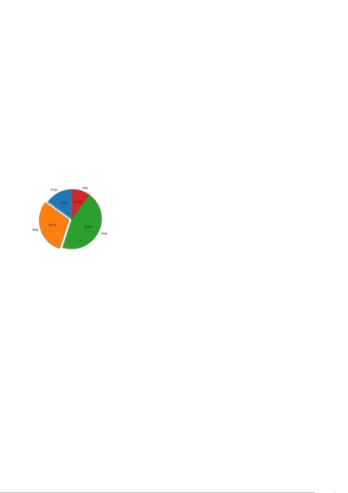
饼图
import matplotlib。pyplot as plt
# Pie chart, where the slices will be ordered and plotted counter-clockwise:
labels = ’Frogs', 'Hogs’, ’Dogs’, ’Logs’
sizes = [15, 30, 45, 10]
explode = (0, 0.1, 0, 0) # only "explode" the 2nd slice (i。e。 ’Hogs’)
fig1, ax1 = plt。subplots()
ax1。pie(sizes, explode=explode, labels=labels, autopct='%1.1f%%’,
shadow=True, startangle=90)
ax1.axis('equal') # Equal aspect ratio ensures that pie is drawn as a circle。
plt.show()
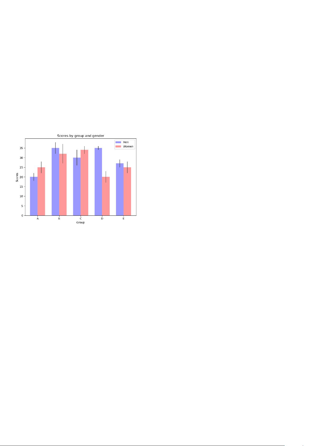
条形图 1
import numpy as np
import matplotlib.pyplot as plt
from matplotlib.ticker import MaxNLocator
from collections import namedtuple
n_groups = 5
means_men = (20, 35, 30, 35, 27)
std_men = (2, 3, 4, 1, 2)
means_women = (25, 32, 34, 20, 25)
std_women = (3, 5, 2, 3, 3)
fig, ax = plt。subplots()
index = np。arange(n_groups)
bar_width = 0。35
opacity = 0。4
error_config = {'ecolor’: '0。3’}
rects1 = ax.bar(index, means_men, bar_width,
alpha=opacity, color=’b’,
yerr=std_men, error_kw=error_config,
label='Men')

剩余24页未读,继续阅读
资源评论


yyyyyyhhh222
- 粉丝: 464
- 资源: 6万+


最新资源
- matlab平台的车牌识别.zip
- matlab平台的车牌出入库识别.zip
- 基于java的高校线上心理咨询室系统设计与实现.docx
- 基于java的个人驾校预约管理系统设计与实现.docx
- 基于java的教学管理系统设计与实现.docx
- 基于java的家电销售展示平台设计与实现.docx
- 基于java的国产动漫网站设计与实现.docx
- 基于java的垃圾分类回收系统设计与实现.docx
- 基于java的宽带业务管理系统设计与实现.docx
- 基于java的课程设计选题管理系统设计与实现.docx
- 基于java的农业设备租赁系统设计与实现.docx
- 基于java的七彩云南文化旅游网站设计与实现.docx
- 基于java的社区老人健康信息管理系统设计与实现.docx
- 基于java的实习生管理系统设计与实现.docx
- matlab平台的车牌号码出入库管理.zip
- matlab平台的车牌识别GUI实现.zip
资源上传下载、课程学习等过程中有任何疑问或建议,欢迎提出宝贵意见哦~我们会及时处理!
点击此处反馈


