Flutter 超实用简单菜单弹出框 PopupMenuButton功能
55 浏览量
2020-12-09
08:31:30
上传
评论
收藏 103KB PDF 举报

Flutter 超实用简单菜单弹出框超实用简单菜单弹出框 PopupMenuButton功能功能
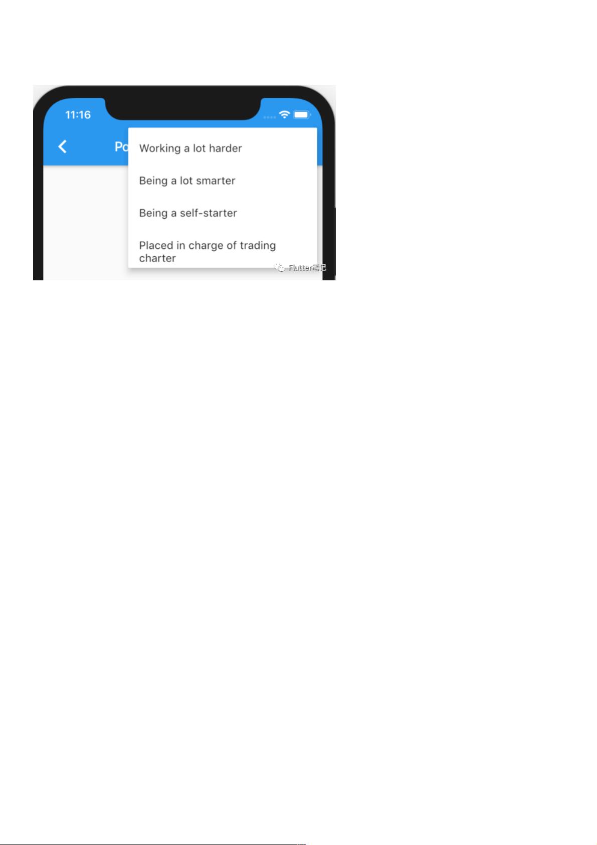
相信在实际开发过程当中,肯定少不了这样的功能:
点击 AppBar 右上角的按钮,弹出一个菜单供用户选择。
幸运的是,Flutter 提供给我们了一个 Widget,直接就能实现如上的效果。
PopupMenuButton
还是老规矩,先看官方的说明:
Displays a menu when pressed and calls onSelected [1] when the menu is dismissed because an item was selected. The
value passed to onSelected [2] is the value of the selected menu item.
One of child [3] or icon [4] may be provided, but not both. If icon [5] is provided, then PopupMenuButton [6] behaves like
an IconButton [7] .
If both are null, then a standard overflow icon is created (depending on the platform).
大致意思为:
当按下的时候显示一个菜单,选择了一个项目的时候会回调 onSelected ,传递的值是所选菜单的值。
可以提供 child or icon ,但是不能同时提供。
如果为空,则提供一个默认的图标,取决于平台。
构造函数构造函数
看完了官方说明,再来看构造函数:
const PopupMenuButton({
Key key,
@required this.itemBuilder,
this.initialValue,
this.onSelected,
this.onCanceled,
this.tooltip,
this.elevation = 8.0,
this.padding = const EdgeInsets.all(8.0),
this.child,
this.icon,
this.offset = Offset.zero,
this.enabled = true,
}) : assert(itemBuilder != null),
assert(offset != null),
assert(enabled != null),
assert(!(child != null && icon != null)), // fails if passed both parameters
super(key: key);
这里面每一个参数应该都很好理解,就不做过多的解释了,
唯一必传的参数就是 itemBuilder ,也可以看到后面的断言:
资源评论


