


RESET
Defined in reset.css. Blue-
print CSS resets all browsers’
default elements including
HTML5 to:
• margin, padding, border: 0
• font-size: 100%
• font-weight: normal
• other font values: inherit
• image borders: 0
Note that tables will still need
cellspacing=“0” in the HTML
mark-up though.
SPAN CLASSES
.span-1 .span-13
.span-2 .span-14
.span-3 .span-15
.span-4 .span-16
.span-5 .span-17
.span-6 .span-18
.span-7 .span-19
.span-8 .span-20
.span-9 .span-21
.span-10 .span-22
.span-11 .span-23
.span-12 .span-24
Use these classes to set the
width of a column
PUSH/PULL CLASSES
Use these classes on an
element to push it right into
the next column, or pull it left
into the previous column.
.push-1 to .push-24
.pull-1 to .pull-24
APPEND CLASSES
Add these to a column to add
empty columns to the right.
.append-1 .append-13
.append-2 .append-14
.append-3 .append-15
.append-4 .append-16
.append-5 .append-17
.append-6 .append-18
.append-7 .append-19
.append-8 .append-20
.append-9 .append-21
.append-10 .append-22
.append-11 .append-23
.append-12
PREPEND CLASSES
Add these to a column to add
empty columns to the left.
.prepend-1 .prepend-13
.prepend-2 .prepend-14
.prepend-3 .prepend-15
.prepend-4 .prepend-16
.prepend-5 .prepend-17
.prepend-6 .prepend-18
.prepend-7 .prepend-19
.prepend-8 .prepend-20
.prepend-9 .prepend-21
.prepend-10 .prepend-22
.prepend-11 .prepend-23
.prepend-12
Blueprint CSS version 0.9.1 (www.blueprintcss.org)
Copyright © 2007-2010 blueprintcss.org
Cheat sheet v.3.5.3 by Gareth J M Saunders (www.garethjmsaunders.co.uk/blueprint)
version 0.9.1
STYLESHEET LINK
Download the latest version from www.blueprintcss.org and add these lines into the <head> of your
page. Check that your href path is correct.
<link rel="stylesheet" href="blueprint/screen.css" type="text/css"
media="screen, projection" />
<link rel="stylesheet" href="blueprint/print.css" type="text/css"
media="print" />
<!--[if lt IE 8]>
<link rel="stylesheet" href="blueprint/ie.css" type="text/css"
media="screen, projection" />
<![endif]-->
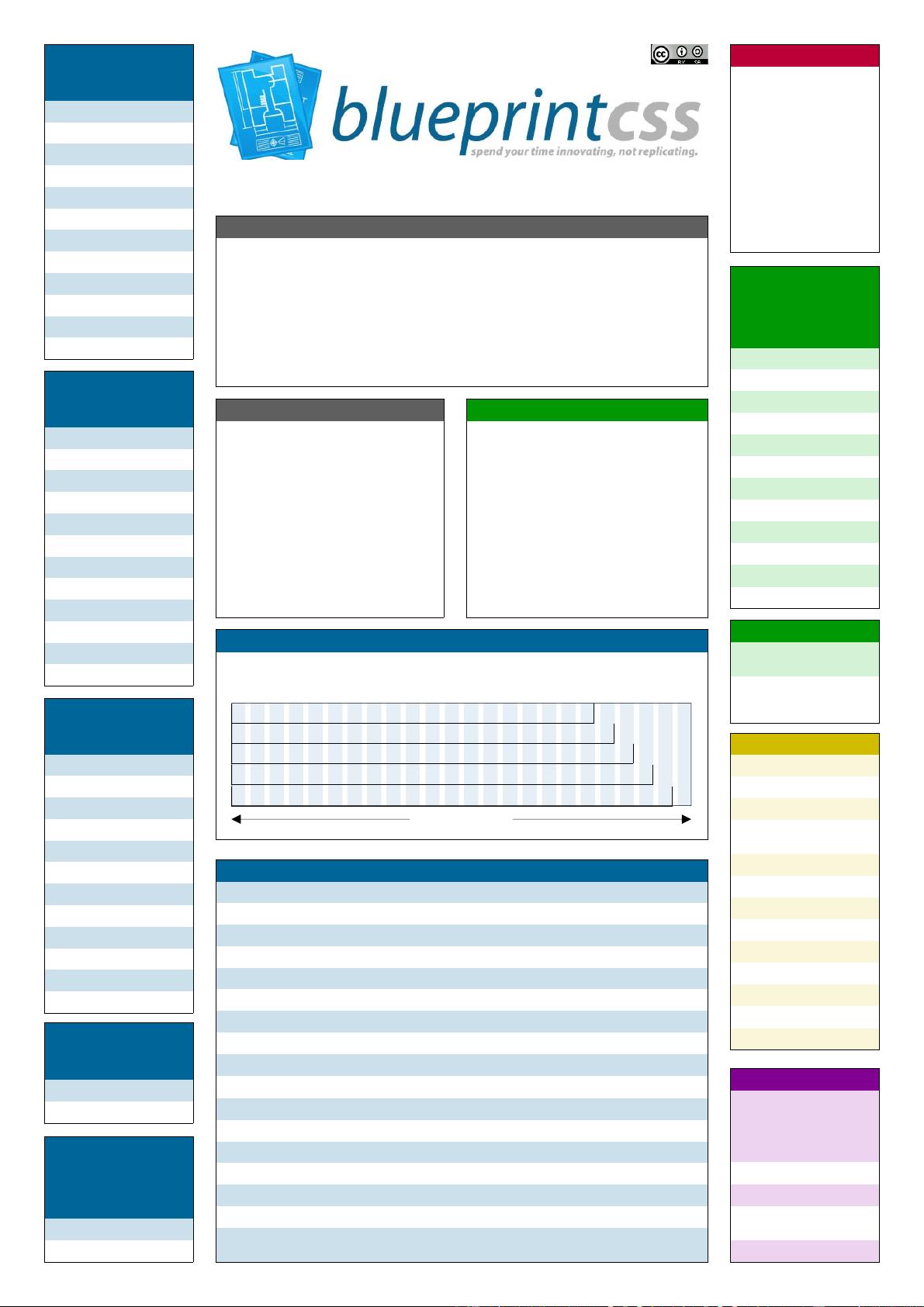
GRID
Defined in grid.css. Each column is 30px wide with a 10px right margin (except the last column which
has no margin). If you need more or fewer columns use this formula to find the new total width:
total width = (columns x 40px) - 10px. (See page two for full grid diagram.)
TYPOGRAPHY CLASSES
These classes are defined in
the typography.css file. Other
typographic elements are also
defined in this file.
.small 0.8em; line 1.875
.large 1.2em; line 2.5
.hide display: none
.quiet color #666 (grey)
.loud color #000 (black)
.highlight bg #ff0 (yellow)
.added bg #060 (green)
.removed bg #900 (red)
.first mL 0; pL 0
.last mR 0; pR 0
.top mT 0; pT 0
.bottom mB 0; pB 0
FORM CLASSES
.error red frame box
.notice yellow frame box
.success green frame box
fieldset pad 1.4em;
m 0 0 1.5 0 em
form.inline line-height 3
input.checkbox and
input.text w 300px p 5px
input.title font-size 1.5em
label bold
legend font-size 1.2em
select w 200px
textarea w390px h250px
input.radio top 0.25em
USAGE
<body>
<div class="container">
<div class="span-16">
<p>Column 1</p>
</div>
<div class="span-8 last">
<p>Column 2</p>
</div>
</div>
</body>
.span-x implies a column (although .column
may still be used). Remember to use “.last” for
the last column of the row to avoid it jumping to
the next row. Columns may be nested inside
one another.
TYPOGRAPHY
typography.css sets up some sensible default
typography. The font-size percentage is of 16px
(0.75 x 16px = 12px). Line-heights and vertical
margins are automatically calculated from this in
ems.
The base line-height is 18px (1.5em). This means
that each element, from line-heights to images
has a height that is a multiple of 18 (or 1.5 if you
use ems).
h1-h6 color is #111 (nearly black); body color is
#222 (dark grey); font-family is “Helvetica Neue”,
“Helvetica”, “Arial”, sans-serif.
GRID CLASSES
.append-x Add these to a column to add empty columns to the right; x = 1 to 23.
.append-bottom Add a 1.5em gutter below an element.
.border Shows a border on the right hand side of a column.
.box Creates a padded box inside a column. (padding: 1.5em; margin-bottom: 1.5em;).
.clear Regular clearing: apply to a column that should drop below previous ones.
.clearfix Clearing floats without extra mark-up. (See http://tinyurl.com/dh352)
.colborder Spans one column with a border in the centre.
.column Use with .span-x classes to create combinations of columns in the layout.
.container A container should group all your columns; use on <div>.
.last The last column in a row needs this class.
.prepend-x Add these to a column to add empty columns to the left; x = 1 to 23.
.prepend-top Add a 1.5em gutter above an element.
.pull-x Use these classes on an element to pull it left into the previous column; x = 1 to 24.
.push-x Use these classes on an element to push it right into the next column; x = 1 to 24.
.showgrid Use this on any .span / .container to see the grid as a background image.
hr.space Use this to create a transparent horizontal rule across a column; also use <hr />.
.span-x Use these classes to set the width of a column; x = 1 to 24; usually used on a div
element. Can also be used on input and textarea elements.
IMAGE CLASSES
p img.left float left; m 1.5
1.5 1.5 0 em
p img.right float right; m:
1.5 0 1.5 1.5
em
VERTICAL CLASSES
.prepend-top mT 1.5em
.append-bottom mB 1.5em
Use these classes on an
element to add vertical space.
http://creativecommons.org/licenses/by-sa/2.5/scotland/
950px (24 columns)
750px (19 columns)
790px (20 columns)
830px (21 columns)
870px (22 columns)
910px (23 columns)
IE FIXES
IE all fixes for: alignment of
inline forms; margin bugs;
padding on fieldset; image
resizing; line-height on sub/
sup elements.
IE5 Fix centre layout.
IE6 Fix legend bug; textarea.
IE6 & IE7 Fix ol numbers and
hr margins.
IE7 Fix code wrap.


